Xceed DataGrid for Silverlight is composed of various elements, each of which play different and important roles within the component. In order to be able to restyle these elements, it is essential to know what these elements are, how they behave, and where they are displayed. So take a few minutes to familiarize yourself with the object-model before getting started.

Editing the Default Styles
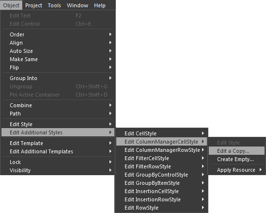
Through the "*Style" properties that are exposed by a grid, the appearance of most of the elements illustrated above can be modified. In order to access these styles, right-click on the datagrid control that was previously added to the scene (see Expression Blend topic) and select the desired style from the Object->Edit Additional Styles menu. You can choose to edit a copy (recommended) of the style or create an empty one. If a copy is used, Blend will generate everything (e.g,. resources, additional templates) that is required by the style and add it in the resources of the containing control (e.g,. UserControl).
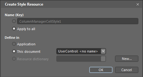
In the Create Style Resource dialog, you can choose whether you want to create an implicit style, which will be applied to all column-manager cells, or an explicit style, which will be applied only to the column-manager cells that reference it.
The newly created style is now ready to be modified and will appear in both the Objects and Timeline window and on the scene's design surface, where it can be selected and its properties edited in the property grid.

 |
In many cases, the Alpha channel for the Background property is set to 0. This may result in many frustrating attempts at changing the background color without the change becoming apparent. Simply changing the Alpha channel to a value greater than zero will make the color magically appear. |
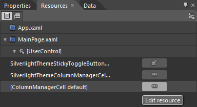
To see how the style modifications reflect in the grid, return the scope to the UserControl where the datagrid is located. To continuing modifying the style, select it in the Resource window and click its Edit Resource button.
Editing the Default Templates
In addition to modifying an element's style, its template can also be modified to change its layout and behavior; however, it is important to first analyze an element's template to fully understand it. For example, let's take a look at the template for a column-manage cell (see ColumnManagerCell class). To view the template that is defined within the style that we previously modified, right-click on the style in the Objects and Timeline window and select the Edit Current option from the Edit Template menu.
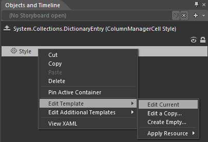
The template, as it is defined in the style, will be extracted and can now be modified, but before we continue, let's take a look at the various parts of a column-manager cell's ControlTemplate in the Objects and Timeline window.
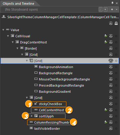

As you can see, what initial appears to be a simple control has turned out to be a rather complex one that is made up of various elements that each play an important part in how the control behaves. In addition, depending on the theme (see Editing Theme Resources section below), the template may vary to include or exclude some elements. Regardless of the complexity of the template, what is important is to first identify the part that provides the behavior or appearance that is to be modified. For example, if we were to add a Rectangle element to create an "underline" for the column-manager cells on mouse over, the appropriate location would be as the last child of the top-most parent grid, as a sibling to the lastVisibleBorder element.
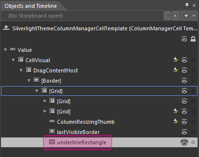
Obviously, some configurations will need to be done, such as:
- Positioning the rectangle at the bottom of the column-manager cell
- Providing it a background color
- Setting its VerticalAlignment property to Bottom
- Setting its HorizontalAlignment property to Stretch
- Setting its Height property to an appropriate value
- Setting its StrokeThickness property to 0
- Setting its Opacity property to 0
- Providing it with a name (e.g., underlineRectangle)
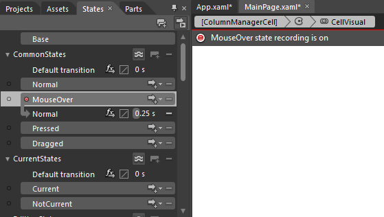
Because we only want the rectangle to be displayed when the mouse is over a column-manager cell, we will need to add a MouseOver state. To add the state, select the States tab and click on MouseOver in the CommonStates section, which should now put Blend in "recording mode". While in recording mode, select the rectangle and change its opacity back to 100. To stop recording, click on the red button displayed on the scene.
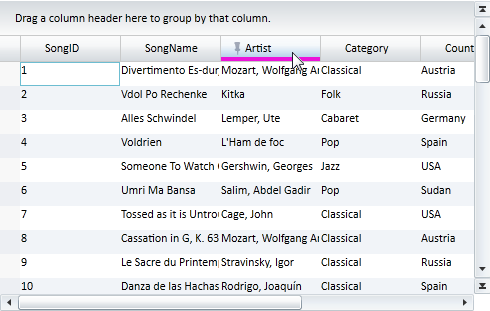
To see the result, simply run the application and move the mouse over any one of the column-manager cells.
Editing Theme Resources
Unlike the default appearance of an element, which can be modified directly through the *Style properties exposed by the datagrid control, the various themes that are provided as part of Xceed DataGrid for Silverlight can also be customized; however, rather than modifying them directly through Blend as described above, their respective resource dictionaries must be imported into Blend and used instead.
 |
The theme resource dictionaries can be found in the C:\Program Files[(x86)]\Xceed\Xceed DataGrid for Silverlight v[#.#]\Themes folder and follow the [Theme]ExplictStyles.xaml naming convention (e.g., JetpackThemeExplicitStyles.xaml ). |
In order to import a theme resource dictionary into Blend, it must be added to the project. To import an existing item, right-click on the project in the Projects window and select the Add Existing Item... option in the context menu, which will allow you to browse to the desired theme resource dictionary and add it to the project.
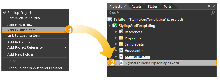
Once the theme resource dictionary has been added to the project, Blend will automatically add it as a resource dictionary to the resources of the application in the App.xaml page; however, because the styles and templates contained in the resource dictionary are named (i.e., explicit), they will not be applied automatically.
When modifying a style or template in a theme resource dictionary, the style (or template) must first be added to the design scene through the Asset Library. Once added, you can edit either the original style or create a copy.
 |
It is recommended that a copy of the template be edited rather than modifying the original style/template. |
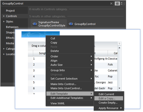
 |
It is highly recommended that you always keep a copy of the original theme resource dictionaries in case modifications overwrite the original styles or templates. |
All resources that are contained in a project are accessible through the Resources window, including external resources such as those contained in the imported theme resource dictionaries.

Obviously, one or more of the theme resources will be used by the template that is being edited; however, if many resources resemble each other, it may not be immediately obvious which one needs to be modified. At this point, it is a good idea to familiarize yourself with the layout of the template to know which element within it uses what resource.
The template that has been modified is located within the element's style. If the style is explicit (i.e., named) and is one of the elements for which the datagrid control provides a *Style property (see Editing the Default Styles section above), the style that contains the modified template can be assigned to the appropriate *Style property via the Property grid. If the style is implicit, it will be automatically to the corresponding elements in the grid.
Once you are done, the initial style that was added to the scene's design surface can be removed.